Nothing is perfect in this house. The house has been lived in, tweaked and added on to for 130 years. But that’s the charm of it for me. Little narrow passages, hidden staircases, mysterious doors and cubbies. Victorian woodworking, glass doorknobs and iron pulls. Simple little moments around every corner where all the layers both modern and old quietly live together at once.
I find joy in waiving a design wand over the little spots that are the strangest, perhaps the most unexpected to dazzle. And so, welcome to my newly refreshed imperfect nook on the 3rd floor landing. Operation: cheer it up.
THE BEFORE
This hallway is at the top of the third floor staircase. The space connects my husband’s office, my office and the twin’s toy room. Originally this had a poorly built-in book case. I love a good bookcase, but this one had shoddy construction.
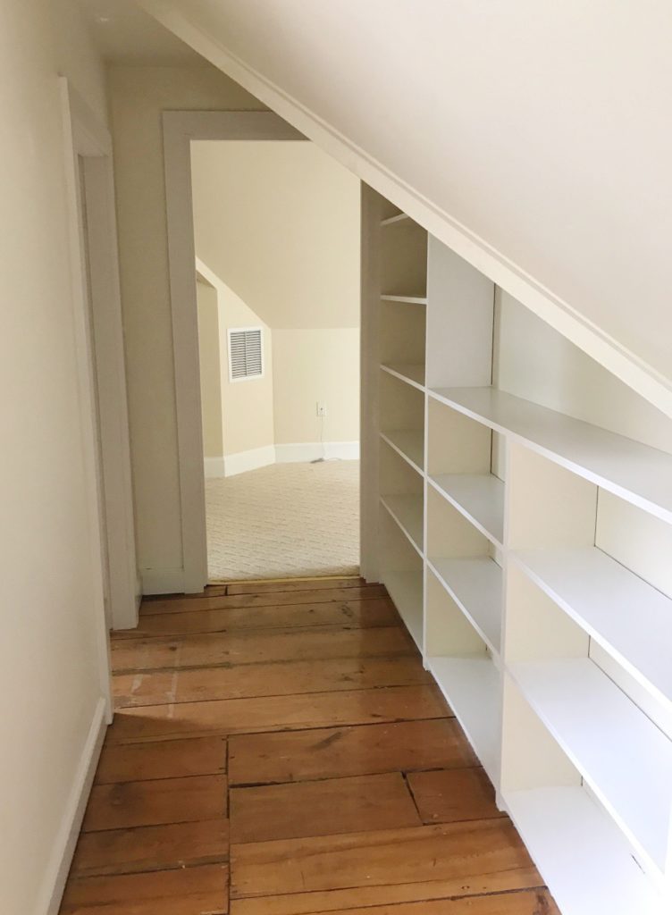
AND NOW
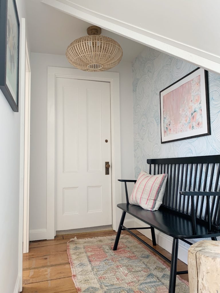
BUILT IN REMOVED
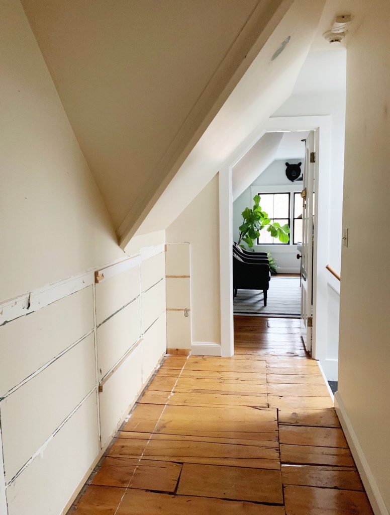
AND NOW
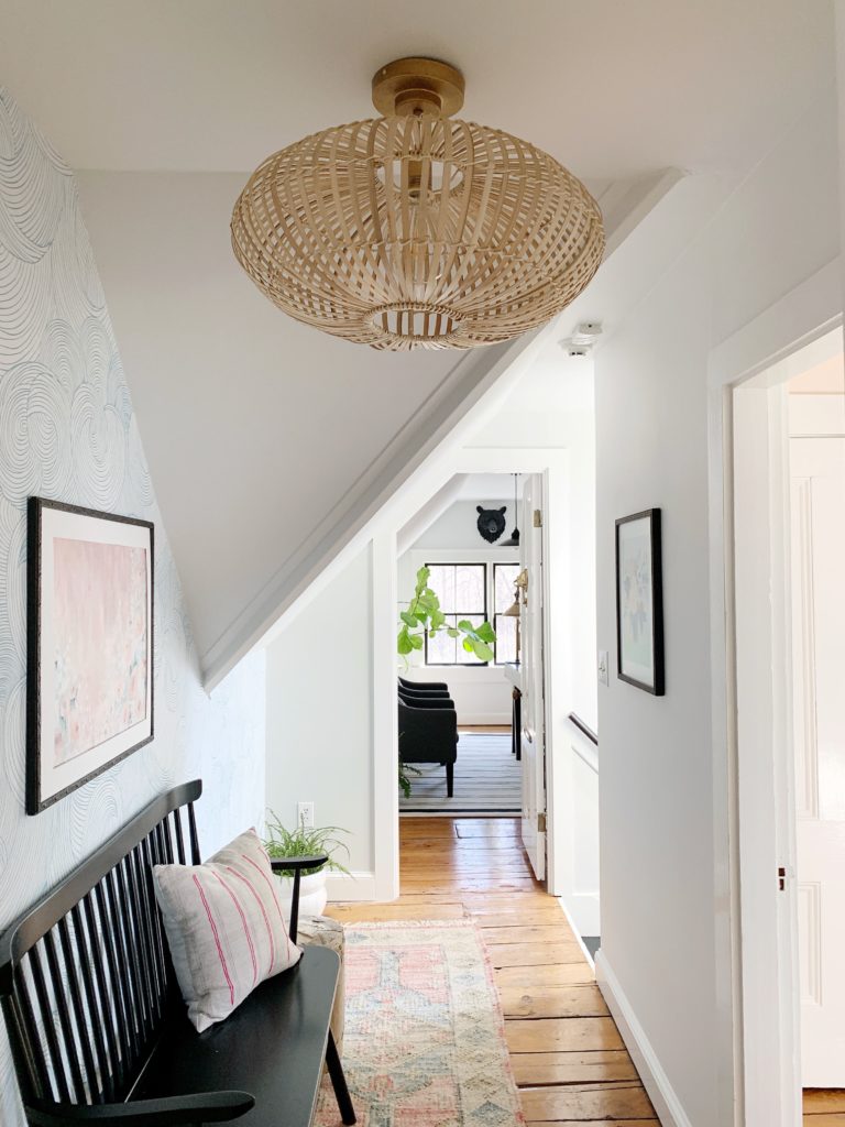
THE RE-FRESH WORKLOAD
- Remove bookcase
- Resurface the wall
- Add door to toy room
- Re-paint
- Switch can light to pendant
- Wallpaper
- Sitting area + art
THE DESIGN
This floor is typically only seen by my family, unless visitors want to haul their way all the way up to the tree house of a floor. Which allowed me to have a little more fun with whimsical paper and color palette. As this space connects three very different purposeful rooms, I wanted it to have elements of each. All three rooms have, shocker, black & white in the palette. My office however, shows off the added scrumptious peachy-pink (Benjamin Moore: Warm Blush). I riffed off that color and added in some blue, and of course black & white. We affectionally call this floor the Tree House, and I wanted the mood of this moment to feel as playful as it alludes to.
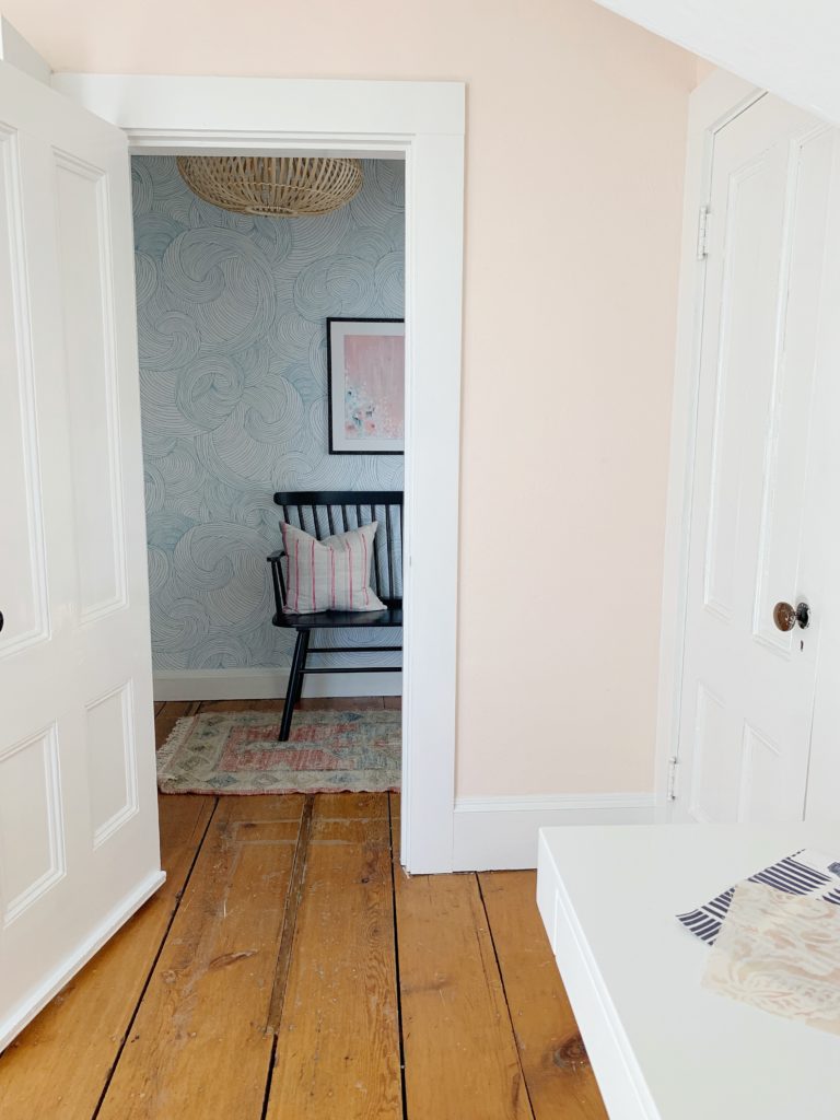
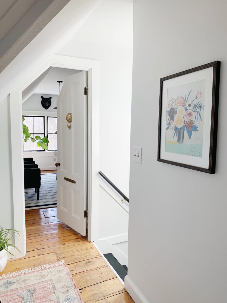
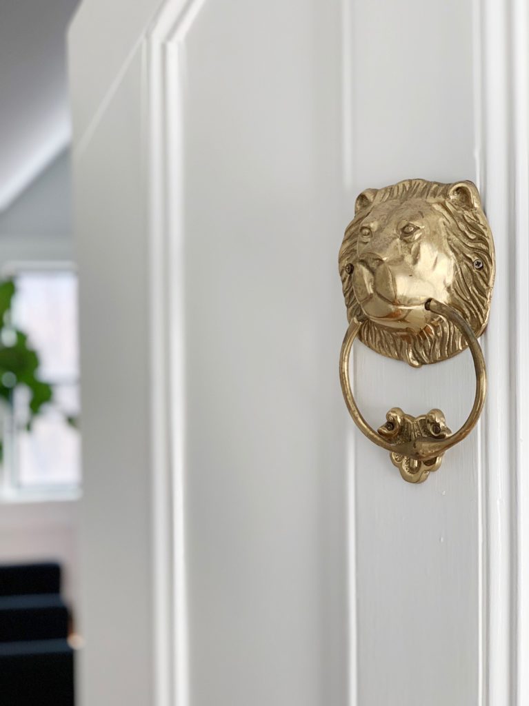
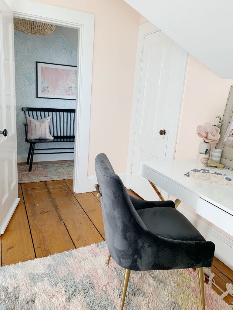
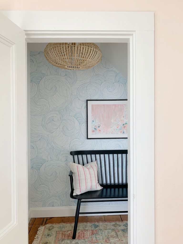
Sharing peekaboos into my office, and my husband’s office to see how this little space connects room to room. Both rooms are very different, but some common elements do tie the areas together
DECORATIVE DETAILS
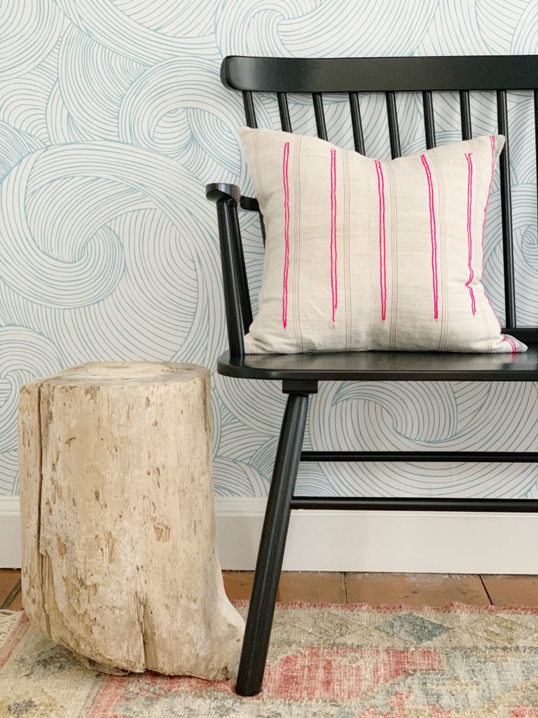
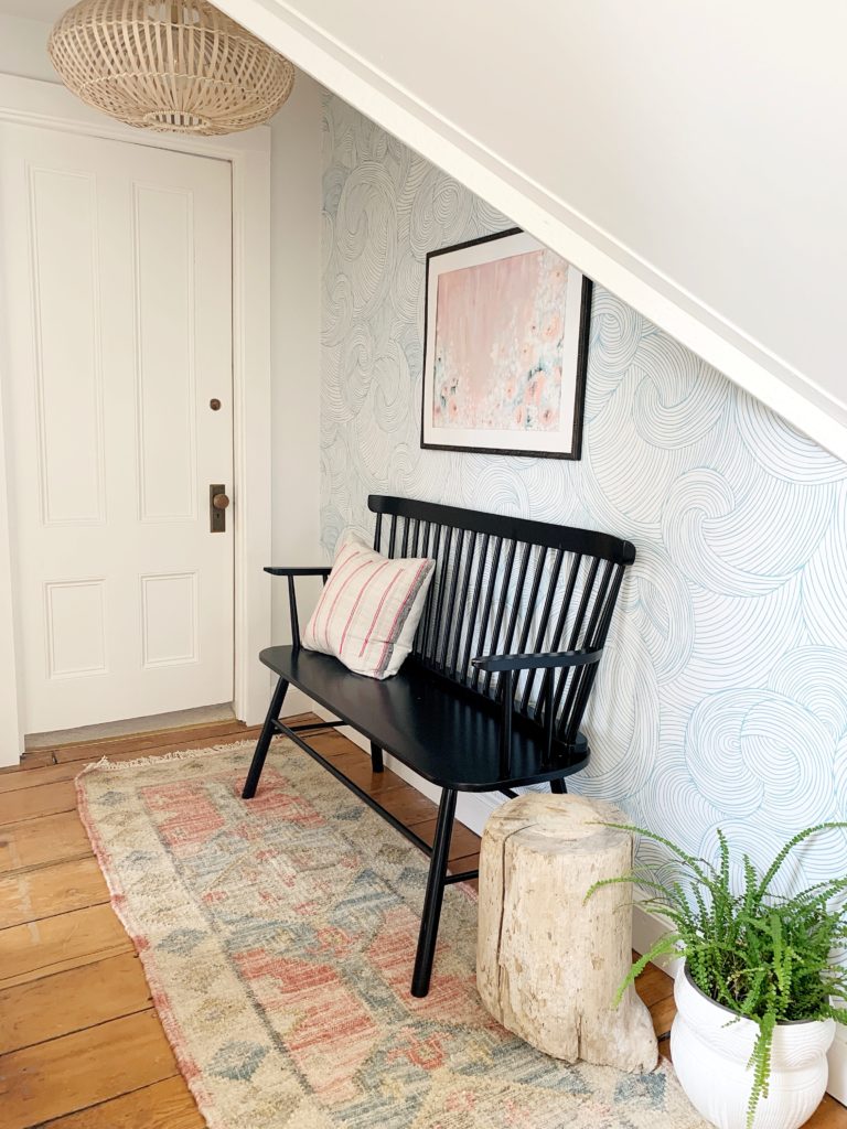
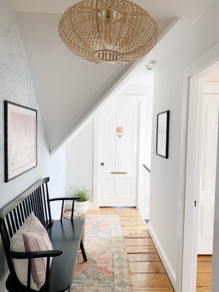
WALLPAPER: The wallpaper makes the space. I partnered with Loomwell to add this magical element. The Piper Wallpaper adds a dose of color, creates a feeling of movement, and an airy vibe all at once. We’ve never installed peel and stick, and let me tell ya, we are fans!! This is so easy to install that Brian had it all done (while working a normal work day) in about one hour. The installation is made even easier by the production team at Loomwell that labels each panel for a no-brainer DIY. They are kind enough to extend 15% off to you with code PALMANDPREP.
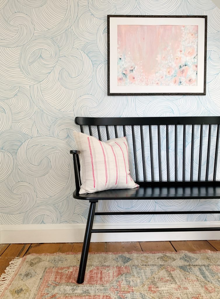
We do have a cheeky debate in our house over this wallpaper. I see stormy waves in the pattern, and my husband sees windy clouds. What do you see?
BLACK BENCH: A castaway bench from an old entry design, that now seems meant for this spot.
ORIGINAL FLORAL ABSTRACT: Well, talk about knocking it out of the park! I commissioned Julie of Blue Day Art (aka my sister) to create a piece that had muted flowers, a mix of pinks, a touch of blue, and a movement that would play nice with the wallpaper. She used acrylic on paper to create this piece. I gasped when I opened the tube holding the art. It might be my favorite ever.
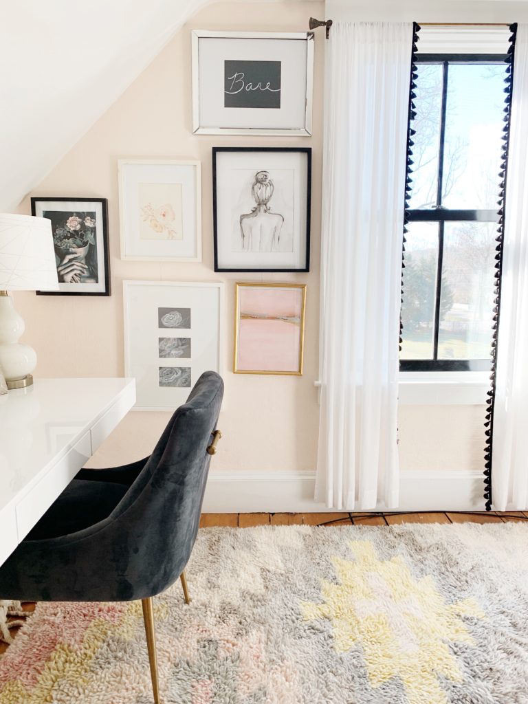
FRAMES: I’ve found a great resource for my framing needs. Art To Frames has a completely customizable option for art. Do you ever find a cool print and struggle forever to find a frame + mat that will fit? Problem solved. Enter your print or art dimensions and they do the rest. I purchased the Industrial Iron picture frame with Compo and the Antique Black with Compo picture frame. Love the details on both these styles. Happy to share with you 15% off site-wide with the code PALM15. Go fill those walls!
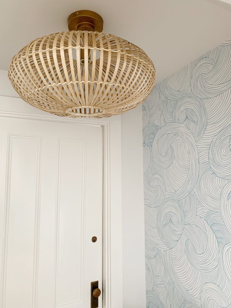
LIGHTING: Honestly, you picked it for me! I was leaning a different lighting route (brass dome), but when I put the options on Instagram stories, your response was overwhelmingly in favor of this beachy beauty. Thank-you, we love it. I’ve paired the light with an oversized bulb light set to give it a little more oompf.
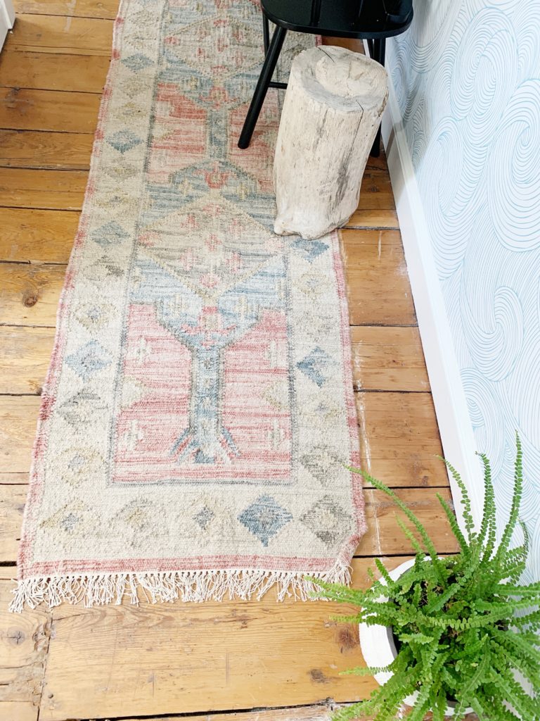
RUG: Vintage-esque + pink in a runner, yes please!!!
SIDE “TABLE”: Every room should have something totally random that’s just a tiny bit off. Huh? My random here is this stumpy side table. I found it on a beach while playing with my kiddos and my dad. I made him carry this into his car and home with me. He no doubt thinks his daughter is nuts, but now I smile every time I see the table as my father foraged this piece for me.
PAINT COLOR // Landing: Pure White by Benjamin Moore
PAINT COLOR // Guest Room: Warm Blush by Benjamin Moore
ART PRINT: Artfully Walls
PILLOW: Danielle Oakey Shop
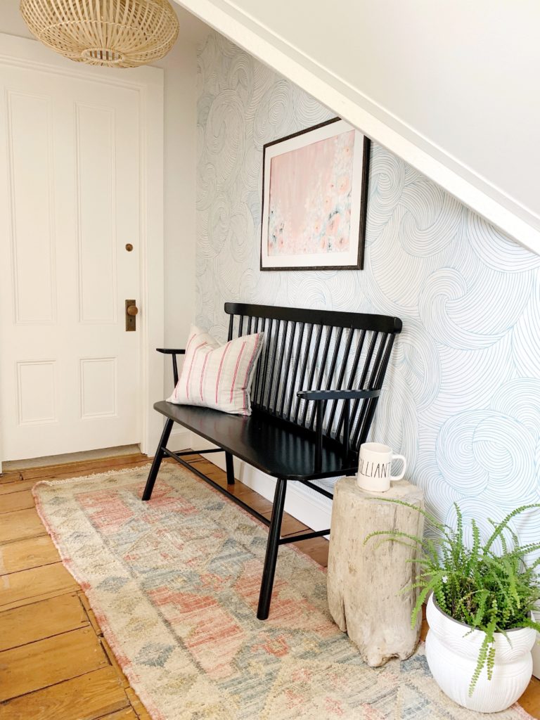
It’s a long way up to this space. But now instead of being an eye sore, you can sit down and catch your breath, sip a coffee and smile while passing through to your destination.
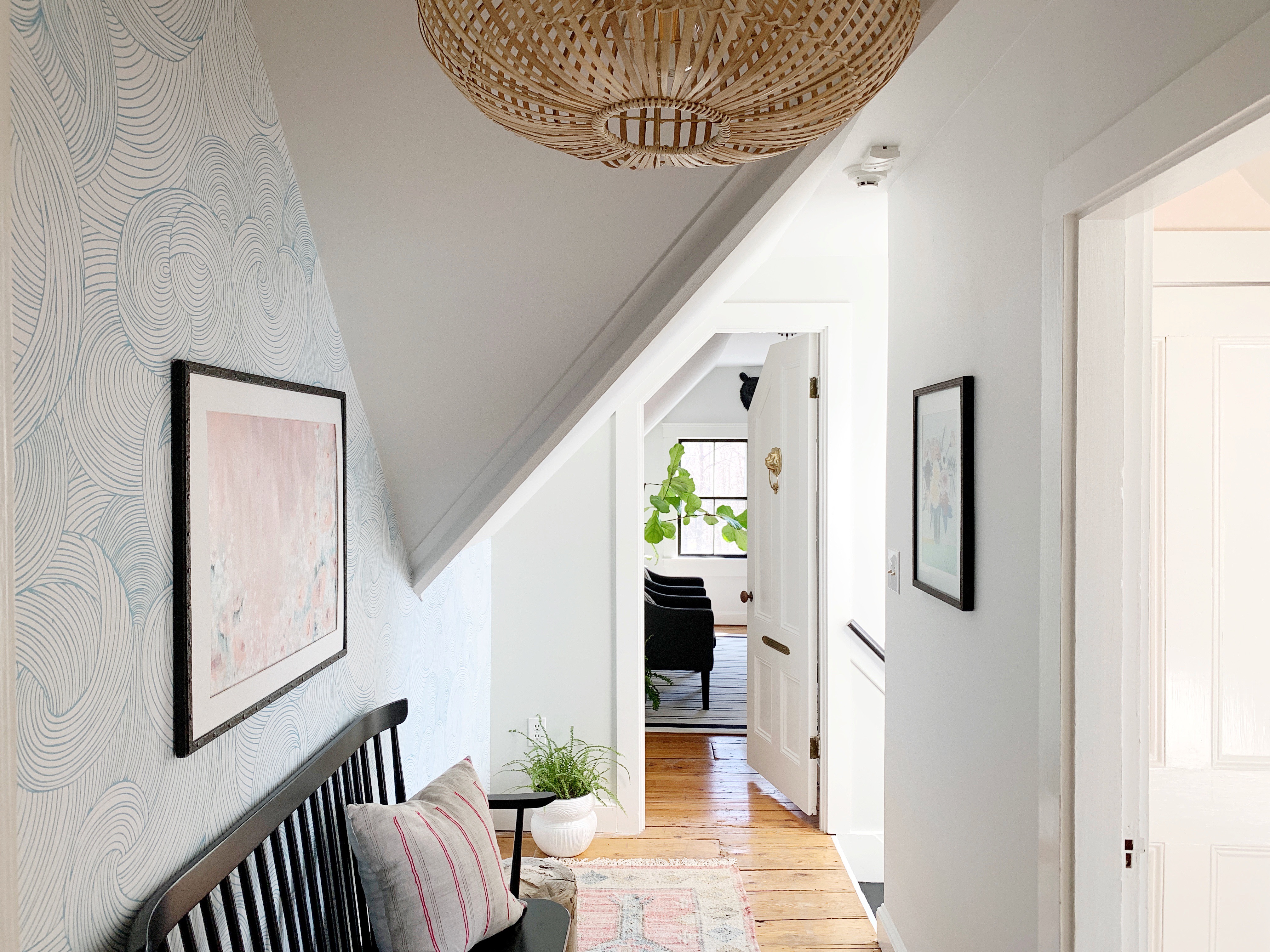

It came out so beautiful!! Love it!!!
thanks to you! xo
How did you connect the bulb to the light fixture? It looks so good!
Thank-you! The World Market part of the light has a ring inside, which would work with any light & cord set I think. This one was larger (more impact!) from Targets new line. 🙂